Valbury / Recurring Buy
Recurring Buy: investing on autopilot, where people can find it
This project shows my work in three areas:
- Competitor Research
- User Flows
- Information Architecture
- Project
- Recurring Buy
- Role
- Product Intern
- Duration
- 2 weeks, Nov 2025
- Platform
- Valbury mobile app
- Status
- Proposed
(I) Executive Summary
Making regular investing automatic, and easy to find
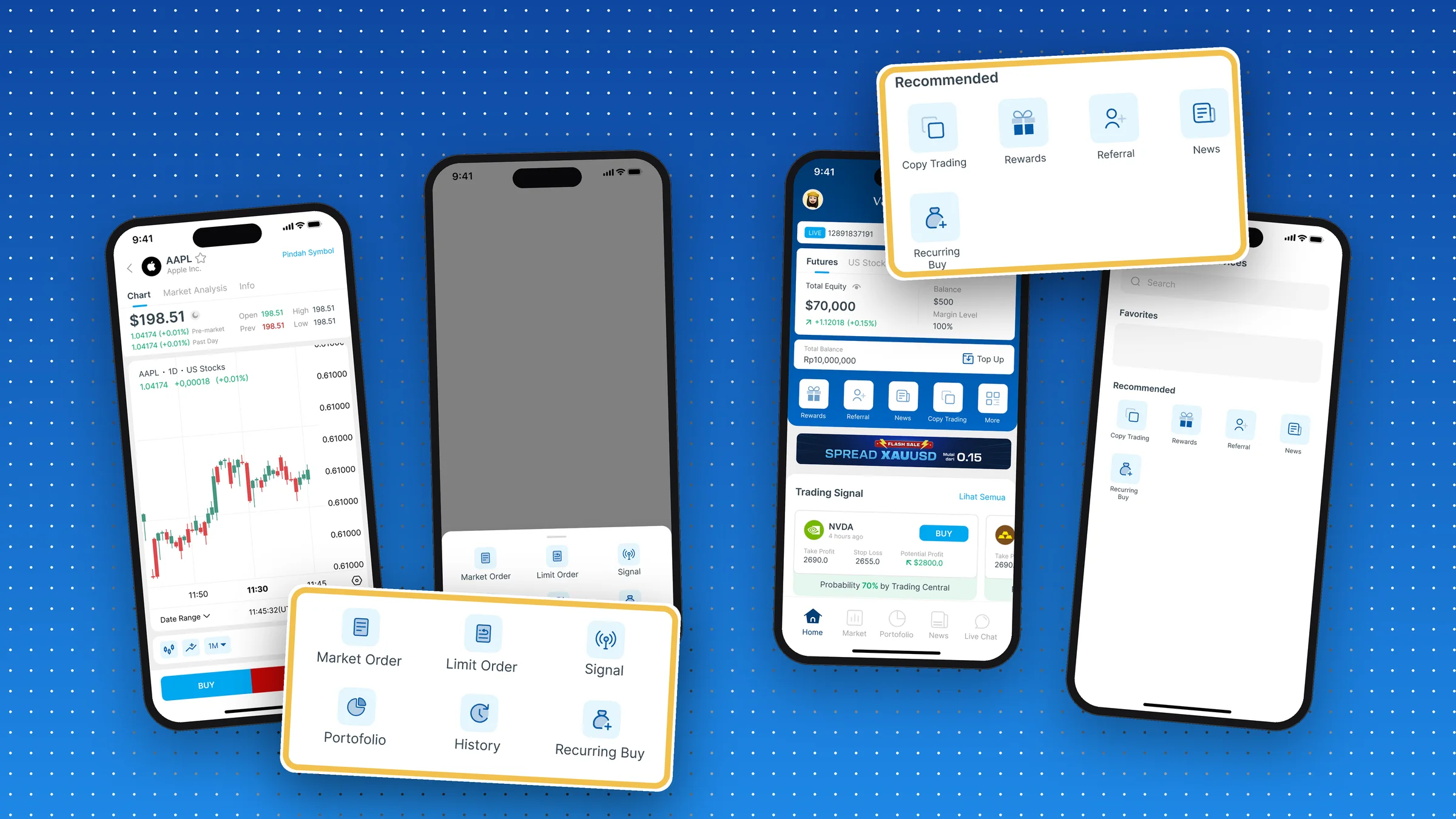
A recurring buy invests a fixed amount on a schedule you choose, say every Monday or on the first of each month, without you lifting a finger. Valbury wanted one. My mentor asked me a focused question: where should it live, so people actually find it? I researched how other apps do it, mapped the user flow and designed the entry points.
On this project, I:
- Did the competitor research: mapped eight recurring-buy journeys in five investing apps, screen by screen, from the home screen to the list of scheduled buys.
- Found the pattern: four of the five hide the feature in a menu, and every setup asks the same four questions.
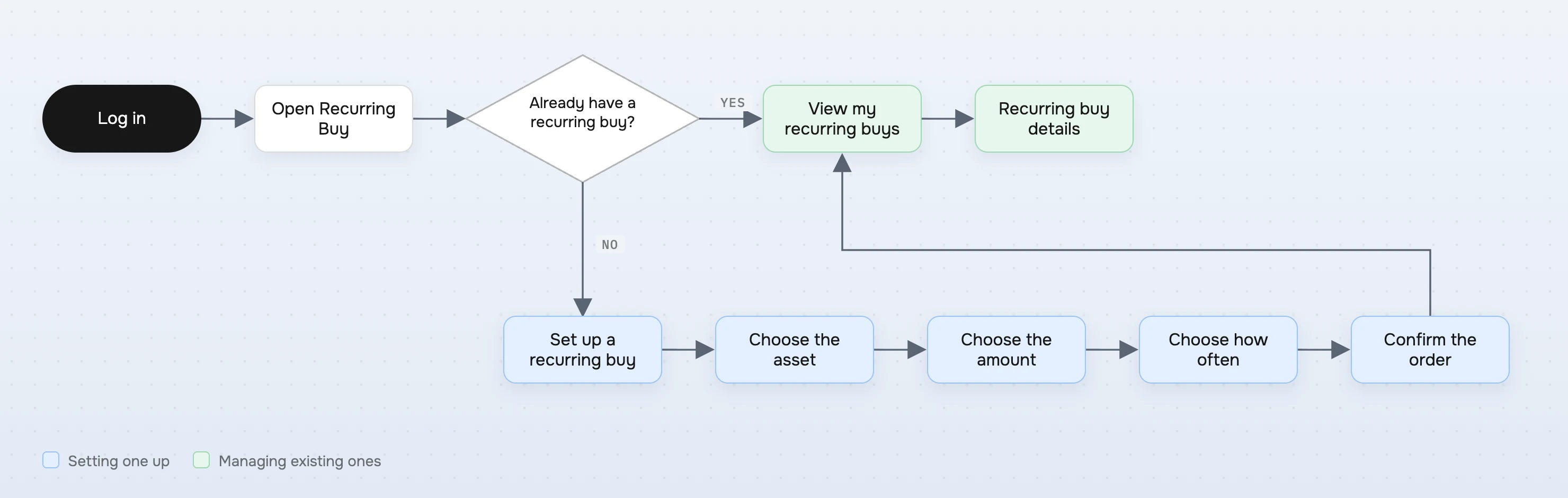
- Mapped the user flow: set up a new recurring buy, or manage the ones you have.
- Designed the entry points: on the stock page at the moment of buying, and in Services from the home screen.
These efforts resulted in
8 journeys
mapped across five investing apps
4 of 5
apps hide the feature in a menu
2
entry points designed for Valbury
Here's how the story unfolds ▼
(II) Context
Built for the long-term investor
In late 2025, Valbury was adding US stocks and crypto to its trading app, and with them a new kind of user: long-term investors who build a position slowly instead of trading every day. For them, the classic advice is dollar-cost averaging: invest the same amount at regular intervals, whatever the price, so you buy more when it's cheap and less when it's expensive.
Doing that by hand takes discipline. A recurring buy does it for you: you decide once, and the app buys on schedule. For Valbury, it was also a way to keep people investing, and using the app, for the long term.
Decide once
the asset, the amount, how often
Auto-buy
the app buys on schedule
Average out
more units when cheap, fewer when not
Habit
investing without having to remember
(III) The Problem
Timing the market costs investors
In 2024, the average US equity fund investor earned 16.54% while the S&P 500 returned 25.05%: a gap of 8.48 points, largely from buying and selling at the wrong moments.
Investing on a schedule takes timing out of the picture, and a recurring buy makes that schedule automatic. But a feature only helps the people who find it. If it's buried three menus deep, the investors who need it most never see it.
- Investing by feel→buying high, selling low→returns lag the market
- Buying by hand each month→people forget or skip a month→the habit breaks
- A feature hidden in menus→few people discover it→nobody benefits
(IV) Competitor Research
5 apps, 8 journeys: most hide it in a menu
I did the competitor research. I picked five investing and crypto apps and mapped the whole recurring-buy journey in each, eight journeys in all: where you find the feature, every setup step, the confirmation, and where you manage your schedules afterwards.
| Where you find it | Taps from home | |
|---|---|---|
| App A | A shortcut on the home screen | 1 |
| App B | More → Services | 2 |
| App C | Profile → Services | 2 |
| App D | More, on the home screen | 2 |
| App E | More → Services → Buy Crypto | 3 |
- 01
Most hide it in a menu.
Four of the five put it behind More or Services. Only one gives it a place on the home screen.
- 02
Setup is always four questions.
What to buy, how much, how often, then confirm with a payment method. Nobody reinvents this, so neither should we.
- 03
It ends in a list you can manage.
The full journeys end in a list of your schedules, where you can check, change or stop each one.
(V) Who It's For
People who'd rather not watch the market
The business built this to turn people into long-term investors. Someone who invests every month keeps using the app for months or years, not just for one trade: that means users who stay, and steady money coming in. Users wanted to invest steadily without thinking about timing, and to find the option without hunting for it:
The long-term investor
Buys the same stocks or coins every month anyway. Wants it on autopilot.
The busy professional
No time to watch the market, and forgets. A schedule removes the effort.
The habit builder
Starting small and unsure when to buy. A fixed schedule answers “when?”
(VI) How Might We
From questions to design rules
How might we help people find Recurring Buy?
Be where people look
In Services, next to the app's other tools, reachable from the home screen.
How might we offer it at the right moment?
Meet the decision
On a stock's page, right beside market and limit orders, when someone is already thinking of buying.
How might we keep setup short?
Four questions, one path
Asset, amount, how often, confirm: the pattern every app used, so there's nothing new to learn.
(VII) The User Flow
Set one up, or manage what you have
The flow starts with one question: does this person already have a recurring buy? If yes, they land on their list and can open any schedule. If not, they set one up in four steps, and after confirming they see it in the same list, so they know it worked.
(VIII) Entry Points
Two doors: where you decide, and where the tools live
My mentor asked for the entry points, so that's what I designed: two ways in, each for a different moment.
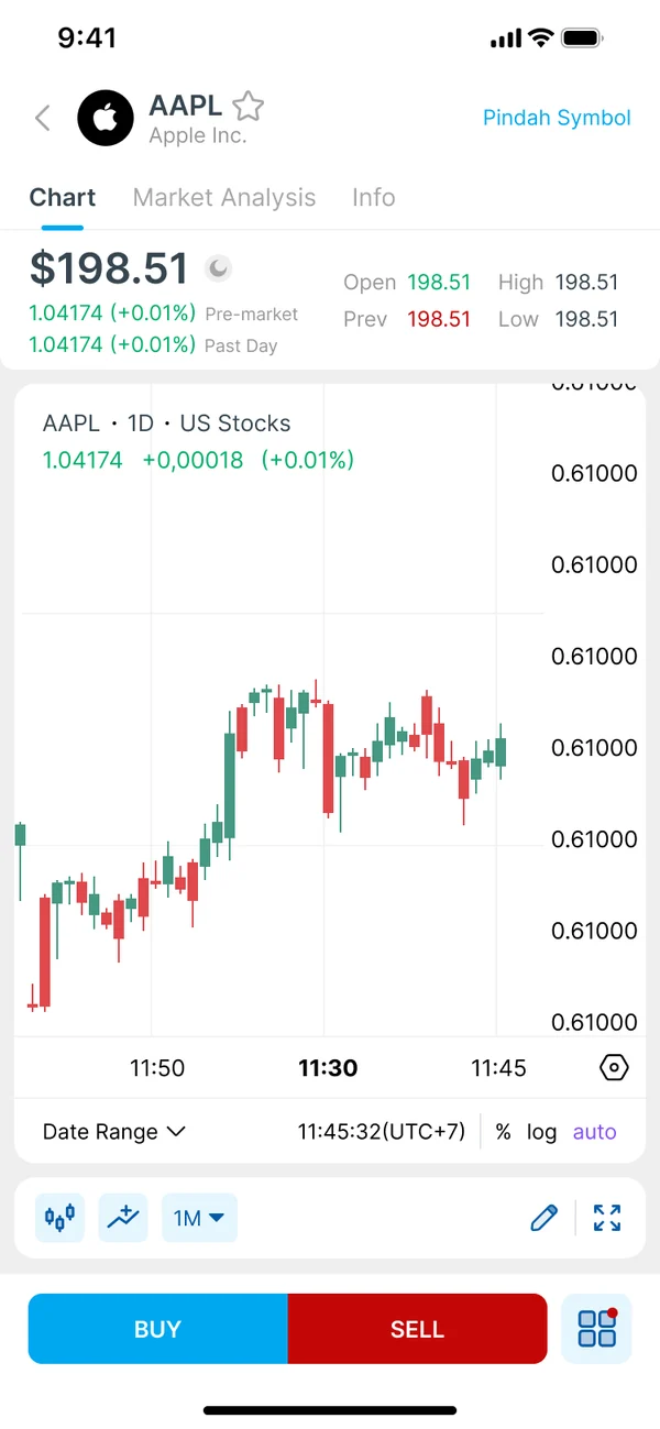
1On a stock's page, tap the trade menu
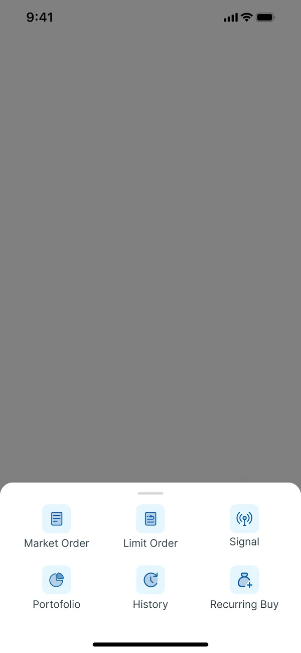
2Recurring Buy sits beside market and limit orders
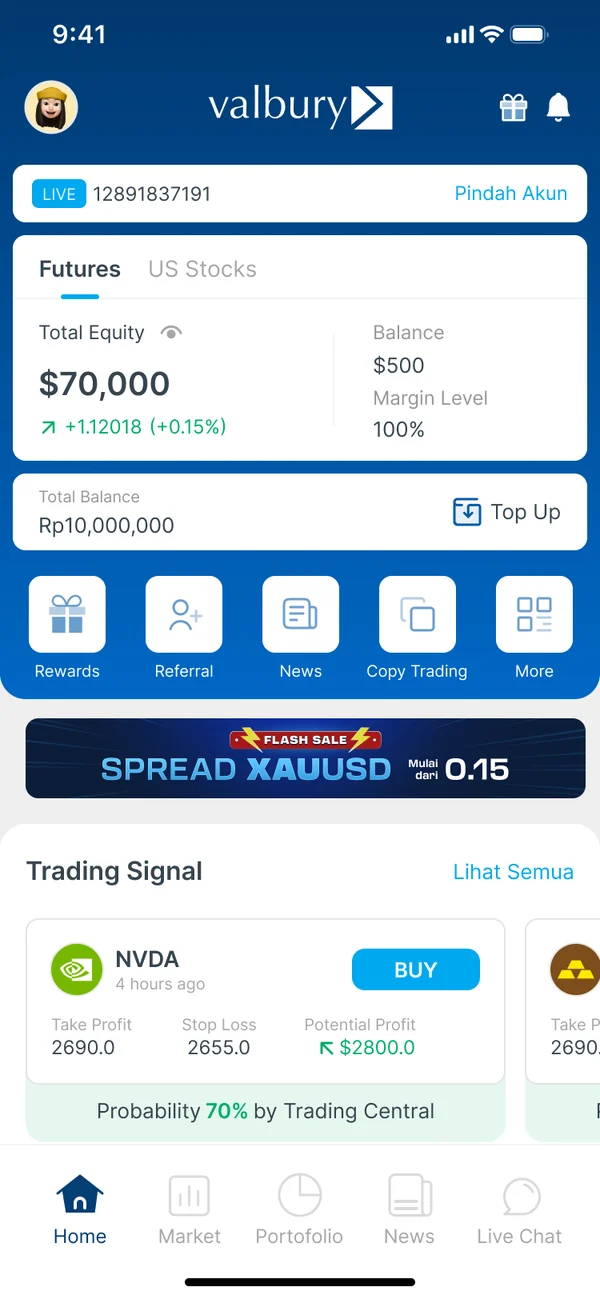
3From home, tap More
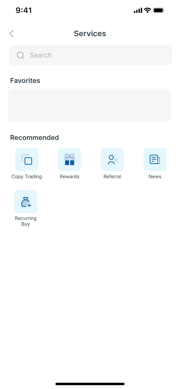
4Recurring Buy is in Services, with the other tools
At the moment of buying
Someone on a stock's page is already deciding. Putting Recurring Buy next to market and limit orders turns “buy once” into “buy every month” at exactly that moment.
Where the tools live
Services is where the other apps put it, so it's where experienced users will look. It works for anyone who comes back to change or check a schedule.
(IX) Success Metrics
How I'd measure success
There was no PRD for Recurring Buy, so there were no targets. I'd judge it as a funnel, and check which entry point people really use:
Find
open Recurring Buy from either entry point
Set up
finish the four steps
First buy
the first automatic purchase goes through
Stay
the schedule is still running months later
| Metric | What it tells us |
|---|---|
| Opens by entry point | Which door people use: the stock page or Services |
| Setup completion | Whether four questions really are short enough |
| Active schedules | How many people are investing on autopilot |
| Schedules still running after 3 months | Whether the habit sticks |
| Money invested through Recurring Buy | The business result: steady, predictable deposits |
(X) Reflection
What I learned
- 01
Findability is part of the design.
A great feature in the wrong place is an invisible one. Deciding where it lives mattered as much as how it works.
- 02
Research makes the case.
Seeing four of five apps hide it in a menu gave me a clear reason for a second entry point, right where people buy.
- 03
Next time, test the menu.
I'd run a quick test asking people to find Recurring Buy, to see whether they look on the stock page or in Services first.
Thanks to Valbury's Sr. UI/UX Designer, my mentor on this project.

