Valbury / Online Registration
Registration: turning demo traders into live investors
This project shows my work in three areas:
- Competitor Research
- UX Design
- Onboarding
- Project
- Online Registration
- Role
- Product Intern
- Duration
- 2 weeks, Sep–Oct 2025
- Platform
- Valbury mobile app
- Status
- Launched
(I) Executive Summary
Getting demo traders to open a real account
Anyone can try Valbury on a free demo account in a minute. But to trade with real money, they need a live account, and opening one meant a long form, a camera and a stack of agreements. Too many people stopped there. We redesigned that step. The new flow keeps every check a regulated account needs, but gives people a reason to start, one clear progress bar and guided photos.
As part of the product team, I:
- Did the competitor research: captured the sign-up flows of seven investing and crypto apps, screen by screen, to see how they get people through verification.
- Turned it into ideas: a clear progress indicator, a short checklist of what's left, and rewards for finishing.
- Designed with the team: helped redesign the whole upgrade, from the card on the demo home to the account status page.
- Stayed on it from start to finish: from the first research to the final screens.
These efforts resulted in
7 apps
sign-up flows researched, screen by screen
3
recommendations for our own flow
Launched
in the Valbury app
Here's how the story unfolds ▼
(II) Context
Everyone starts on a demo account
Valbury Asia Futures runs a trading app for futures and forex traders in Indonesia, and in late 2025 it was adding US stocks and crypto. New users sign up with their phone number, name and email, set a PIN, and land on a demo account with practice money.
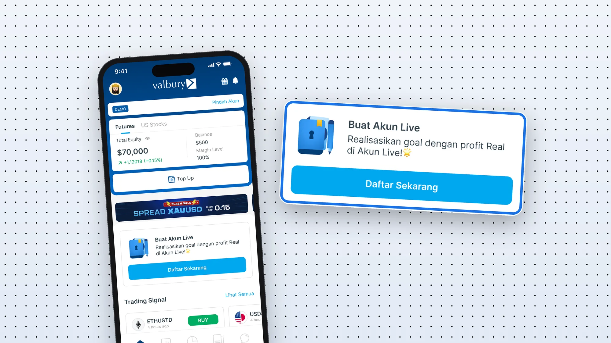
A live account is different: it's regulated, so Valbury has to verify who you are, what you do and how much risk you can take before you deposit a single rupiah. On the demo home, a card invited people to start.
(III) The Problem
16 steps and 12 documents between a demo and real money
68% of consumers have abandoned an application for a financial product. The top reasons: it took too long, and it asked for too much personal information.
The same happened to us. Too many demo users who tapped the card never finished. That step matters more than any other: without a live account nobody can add money, and without deposits the business earns nothing. Here's what they faced in the live app: an intro promising four stages of about two minutes each, then 16 steps and 12 documents.
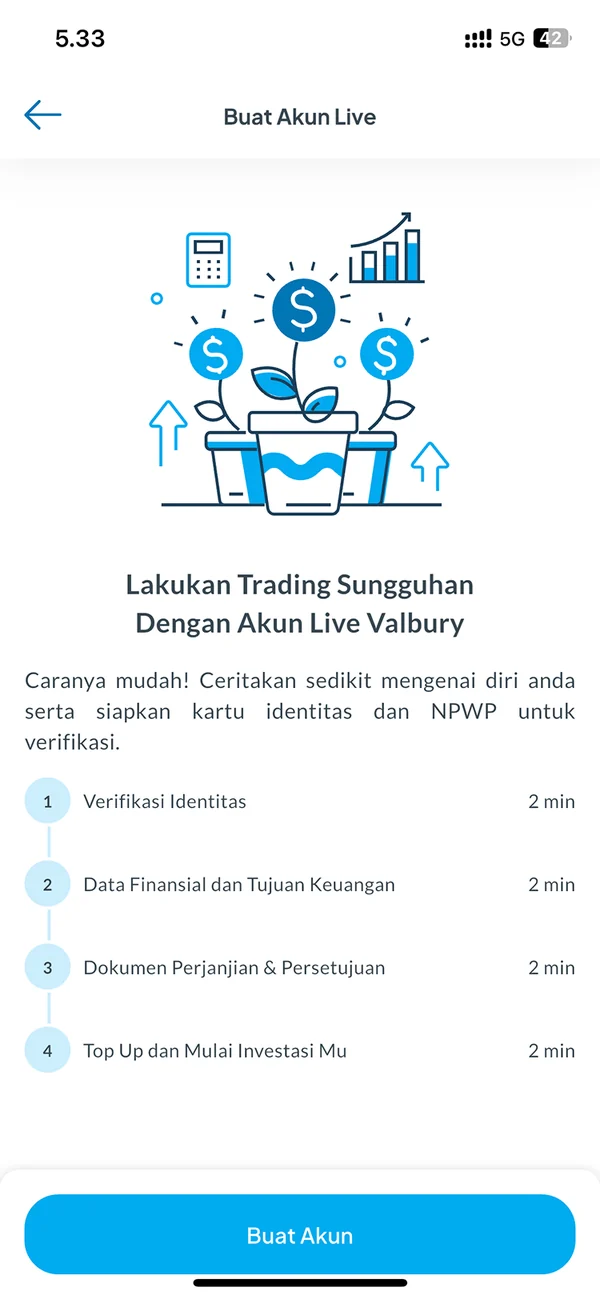
1The promise: 4 stages, about 2 minutes each
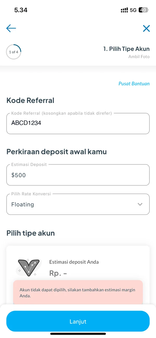
2Estimate a deposit; too low locks the accounts
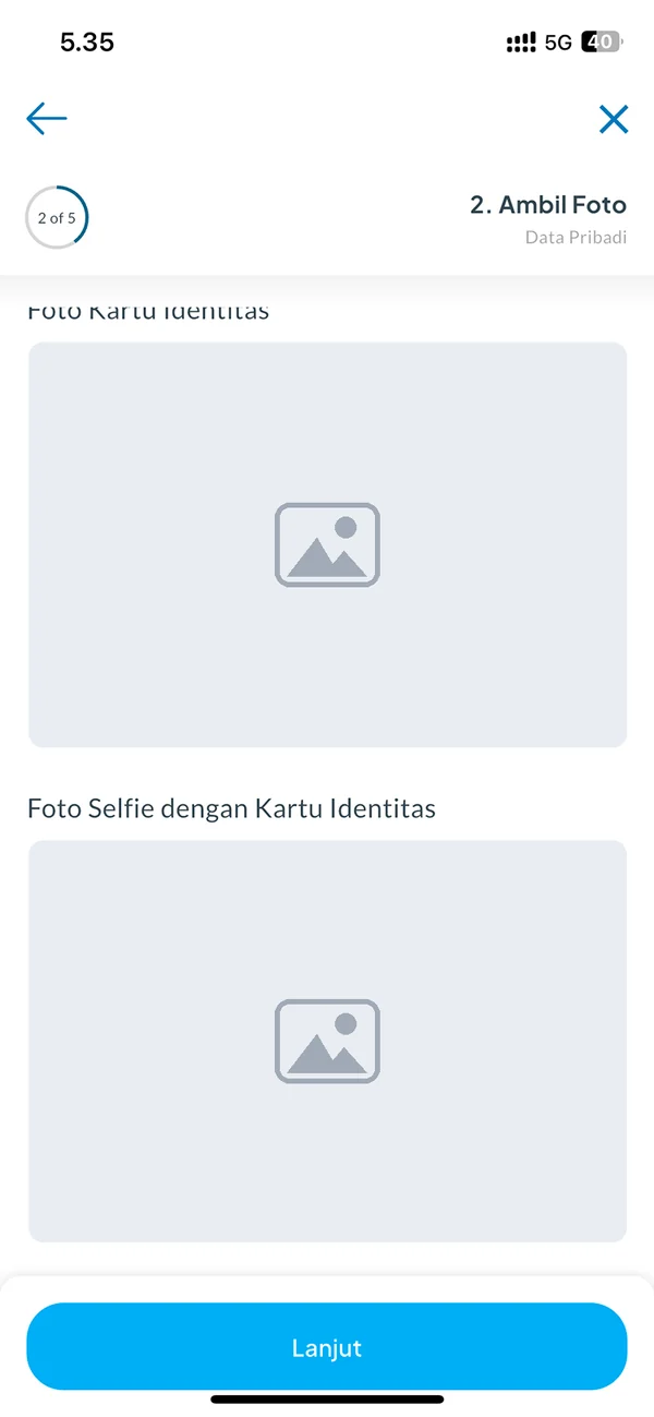
3Upload your ID, a selfie and your tax card
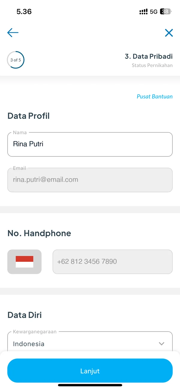
4Personal and ID details
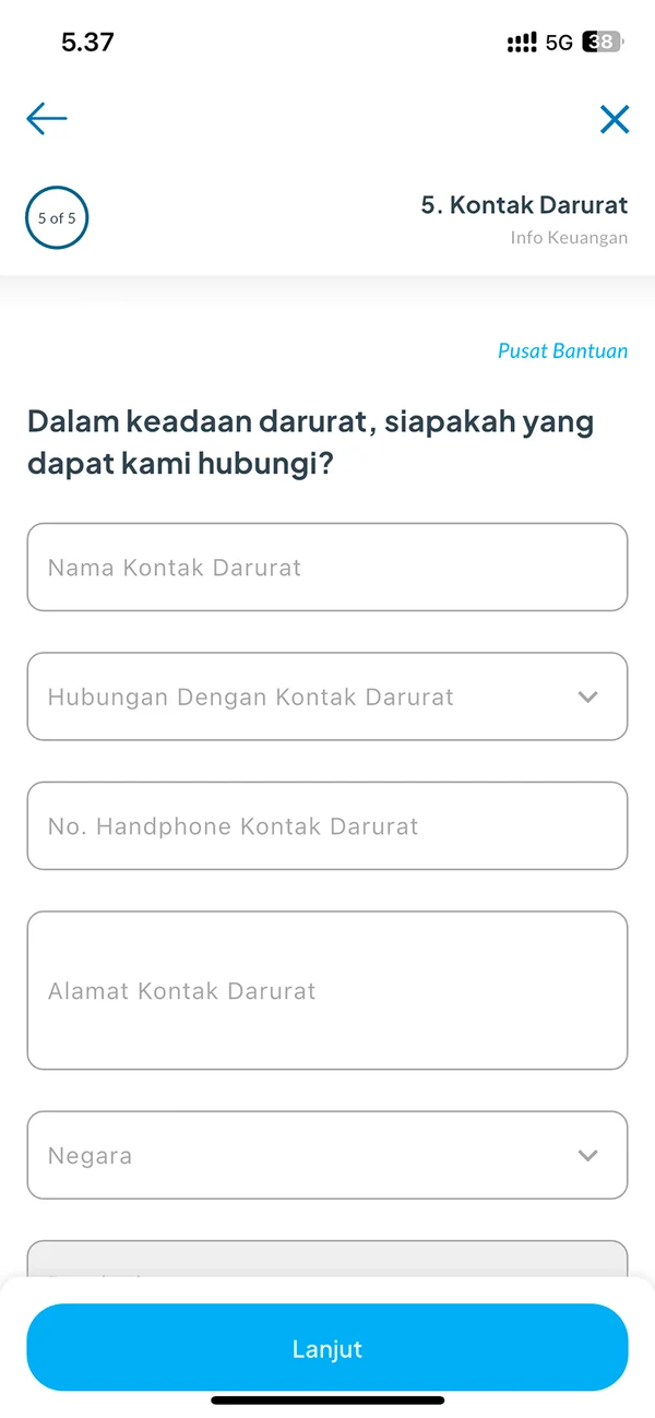
5An emergency contact, with full address
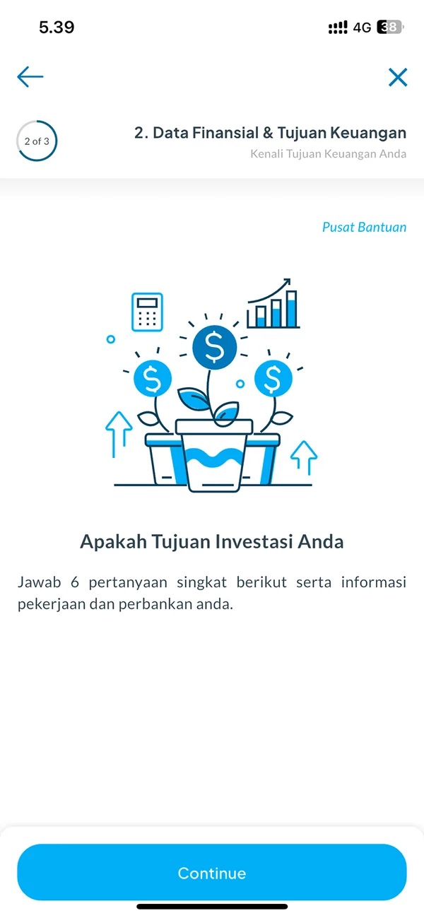
6Stage 2: six questions, then job and bank
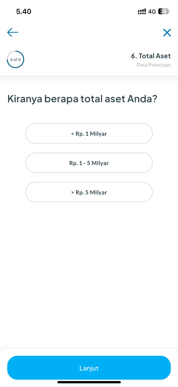
7One question per screen
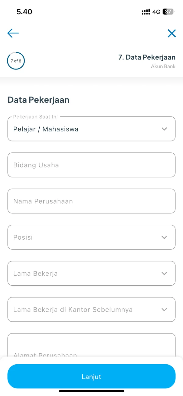
8Job details
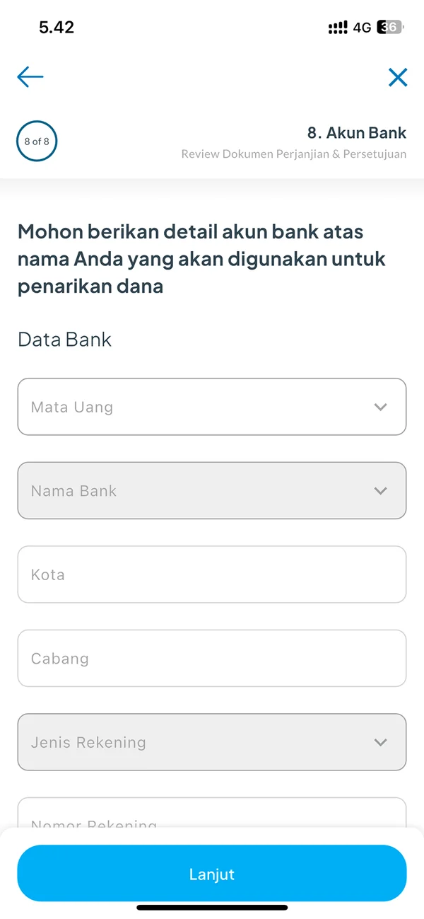
9Bank account
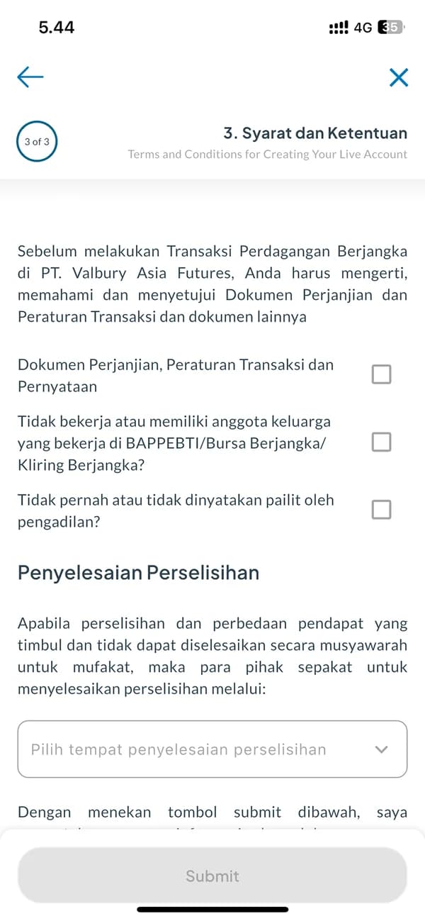
10Stage 3: terms and conditions
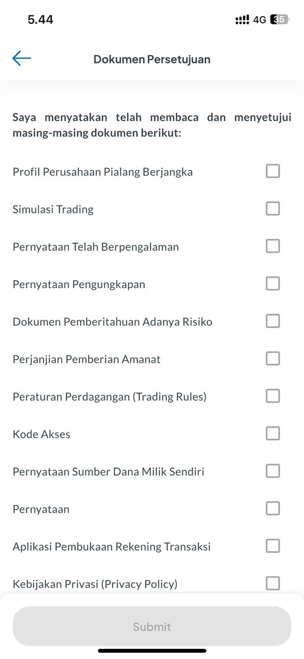
1112 documents to open and agree to
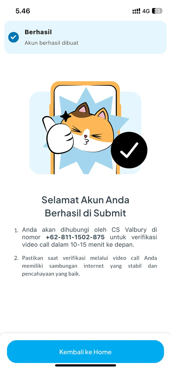
12Then wait for a video call
- The invitation says little about what you get→no reason to push through 16 steps→people put it off
- The step counter restarts every stage→5 steps, then 8, then 3→no idea how much is left
- Three photos on one screen, with no examples→people guess what a good photo is→some get it wrong
(IV) Competitor Research
7 apps, one question: how do they get people through?
I did the competitor research. I picked seven investing and crypto apps, local and global, and captured every screen of their sign-up flow, from the first screen to “account under review”. For each I noted the order of the steps, what they ask for and when, and how they show progress.
7
apps' sign-up flows captured
Every screen
from welcome to account review
3
things compared: order, asks, progress
3
ideas for our flow
Nearly every app asks for an ID photo and a selfie: verification can't be skipped, only made easier to finish. So my recommendations were about the journey, not about removing steps:
- 01
Show a clear progress indicator.
People finish what they can see the end of. Show every step, and where they are.
- 02
Make it a three-step checklist.
Demo account ✓ → ID verification → bank linking → start investing. The first box is already ticked.
- 03
Reward finishing.
A small welcome bonus (e.g. Rp 20K credit or a free stock or crypto trial), or lower fees for verified users.
(V) Who It's For
People who are curious, but not yet committed
The business wanted more demo users to become funded live accounts: that's where deposits, trading volume and revenue begin. Users wanted to know what they get for the effort, how much is left, and how to get each step right the first time. Three kinds of people reach the upgrade card:
The demo trader
Practising with play money. Curious, but not sure a live account is worth handing over an ID.
The ready investor
Has decided and wants to deposit today. Loses patience with every extra screen.
The existing trader
Already trades futures on Valbury and now wants a US stocks or crypto account too.
(VI) How Might We
From questions to design rules
How might we give people a reason to finish?
Payoff first
Show what a live account gets you before asking for anything.
How might we show how much is left?
One path
One progress bar for the whole flow, naming the current and next step.
How might we help people get photos right?
Show, don't tell
One photo at a time, with do and don't examples and a check before you confirm.
(VII) The New Flow
Try first, upgrade when you're ready
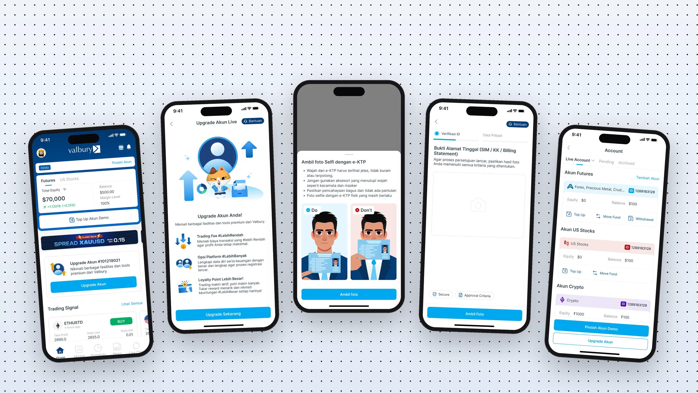
We designed the new flow as a team. It follows the three rules above, and two of my recommendations are in it: rewards up front (the upgrade page leads with lower trading fees and bigger loyalty points) and one clear progress indicator. It also ends better: your account shows as Pending, and you can update your details later.
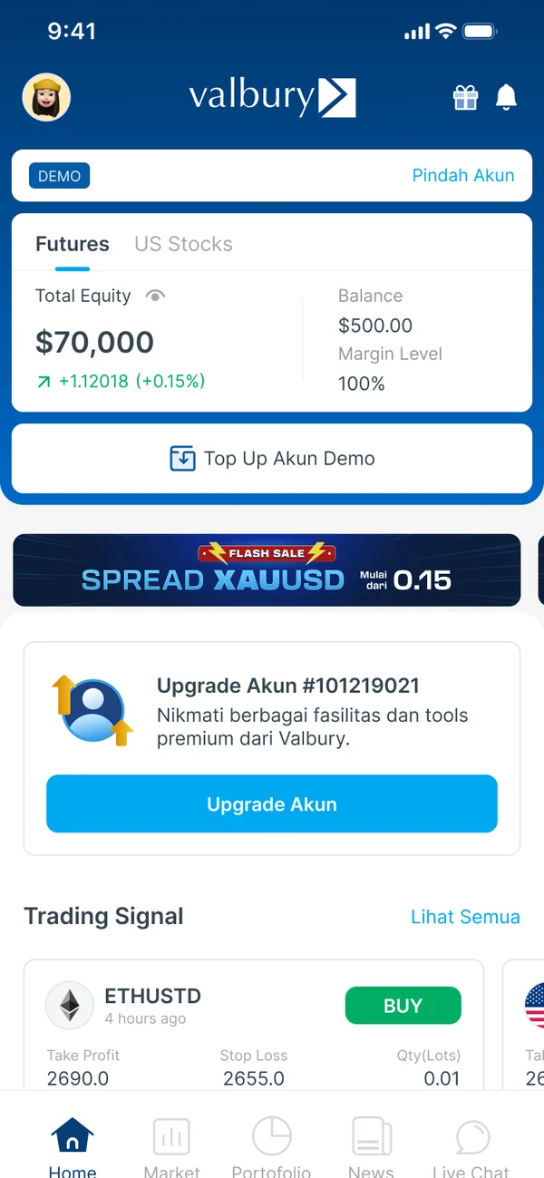
1An Upgrade card on the demo home
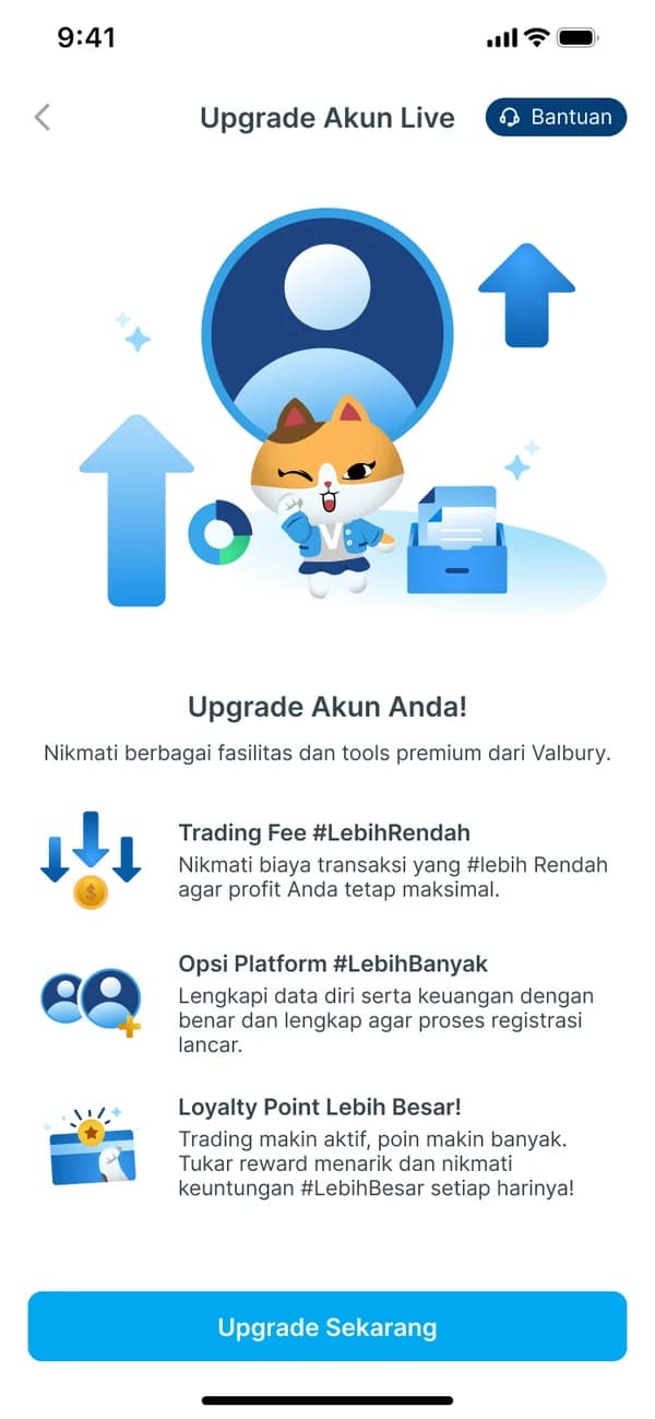
2See what you get first
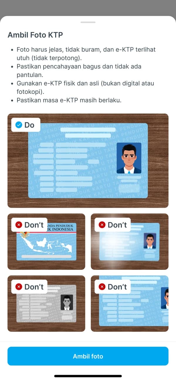
3Photograph your ID card
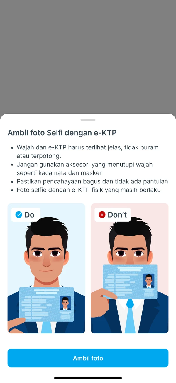
4Take a selfie holding your ID
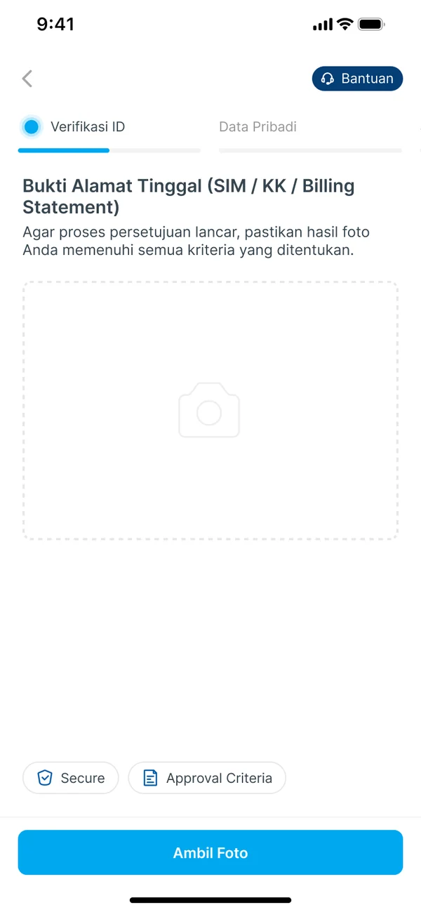
5Add proof of address
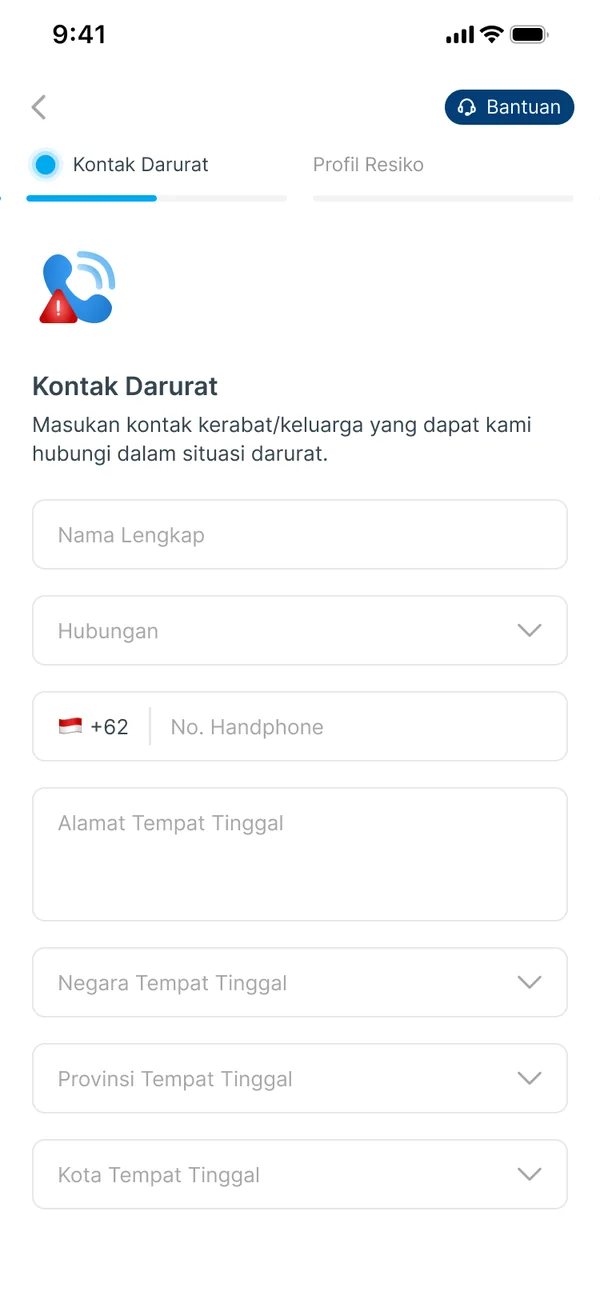
6Add an emergency contact
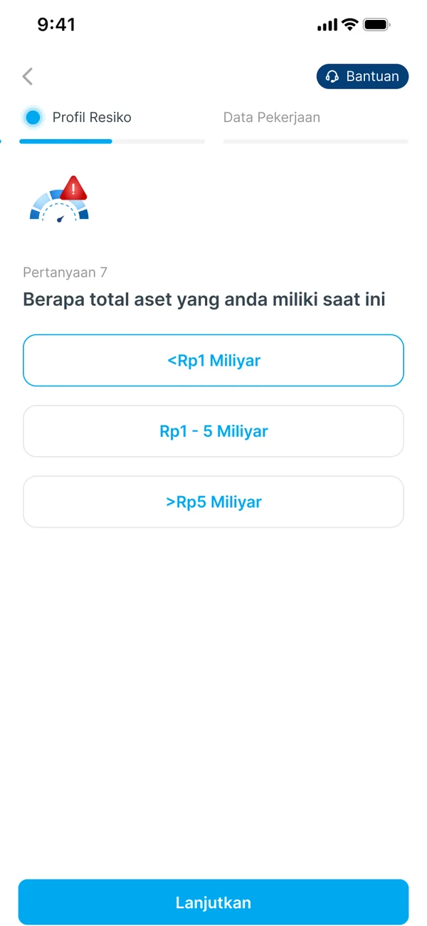
7Risk questions, now before job and bank
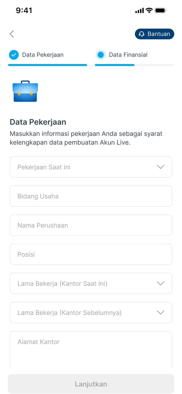
8Describe your job
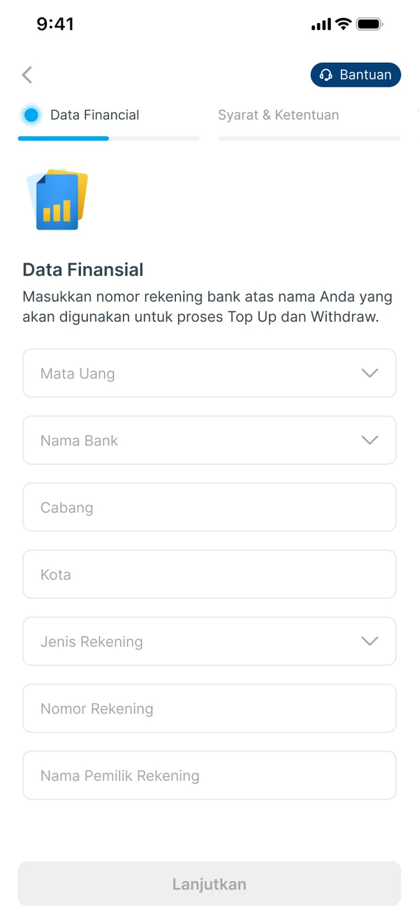
9Add your bank account
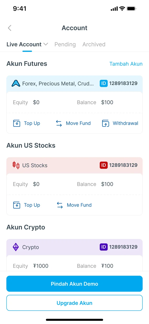
10See your account's status
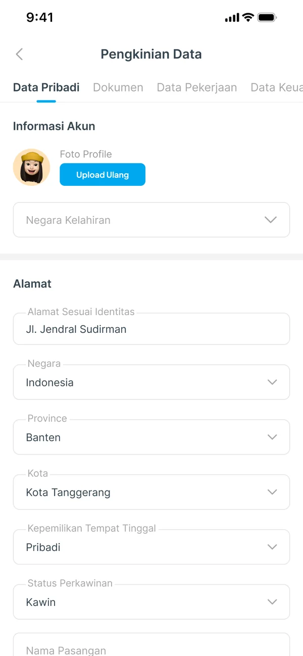
11Review and update details later, in tabs
(VIII) Before and After
Same checks, fewer reasons to stop
We couldn't drop the checks a regulated account needs, so we changed what surrounds them. Side by side, problem by problem:
| Before (the live app) | After (the redesign) | |
|---|---|---|
| The invitation | An intro promising 4 stages of 2 minutes | An Upgrade card, then a page with three concrete benefits |
| Progress | 3 stages; the step counter restarts in each | One stepper for the whole flow, naming the current and next step |
| Photos | ID card, selfie and tax card on one screen, with no examples | One photo at a time, each with do and don't examples and a check before you confirm |
| After you submit | A “submitted” screen | Pending status on your Account page, and details you can update later |
(IX) Success Metrics
How we'd measure success
The redesign launched in the Valbury app. I framed its success as a funnel, from demo user to funded account, so each stage shows whether one part of the redesign is doing its job:
Demo
users who see the upgrade card
Start
tap Upgrade after the benefits page
Submit
complete every step
Deposit
fund the new live account
| Metric | What it tells us |
|---|---|
| Upgrade start rate | Whether the benefits page makes the case |
| Completion by step | Where people still stop, and which step to fix next |
| Time to submit | Whether guidance and one progress bar get people through faster |
| First-time approval | Whether photos and details are right the first time |
| First deposit | The business result: a live account with money in it |
(X) Reflection
What I learned
- 01
You can't delete compliance, but you can design around it.
The checks stayed. What changed was why you'd start, how easy each step is to pass, and what you see at the end.
- 02
Set honest expectations.
The old flow promised two minutes per stage, then asked for 16 steps. A flow that's upfront about its length loses fewer people halfway.
- 03
Next time, test the rewards.
I'd test a small welcome bonus against lower fees, to see which gets more people to the finish.
Thanks to Valbury's Sr. UI/UX Designer, Lead Product Manager and VP of Product.